
Amazon Kindle Ad Campaign
Design Problem
Seamlessly integrate a modern-day product into an artist’s paintings, in order to create a cohesive marketing campaign.

Design Process
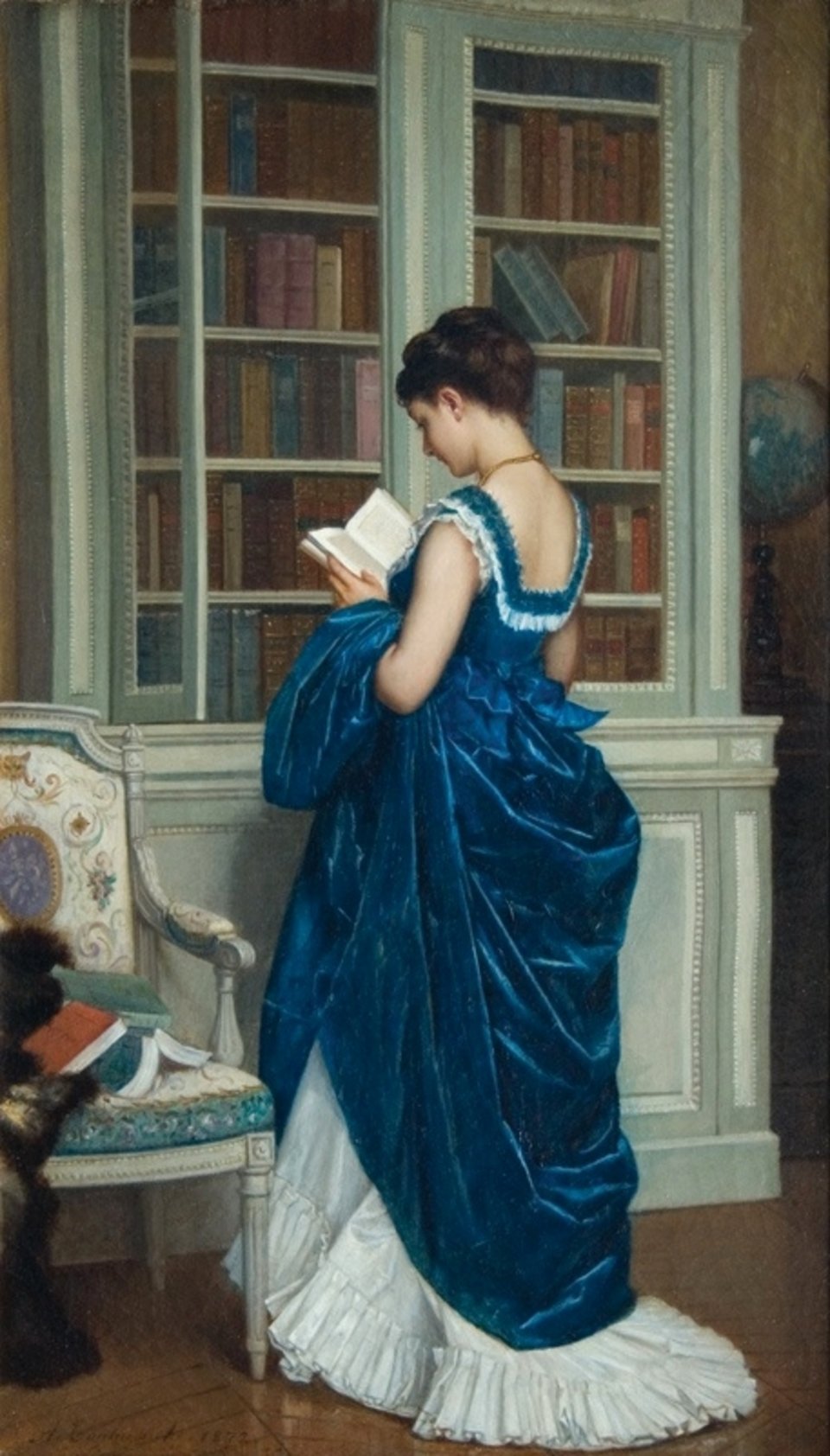
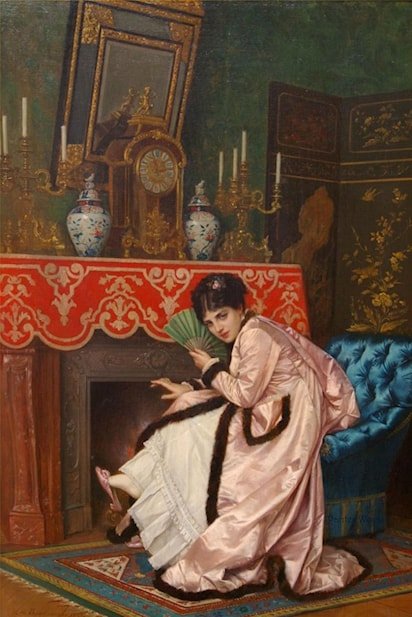
As an avid reader since childhood, I knew I wanted to use the Amazon Kindle as my product for this project. I selected Auguste Toulmouche because of the women who were the subjects of his art. They appear bored, preoccupied, and even asleep. Once I saw the Toulmouche paintings, I knew I wanted to create something humorous and ironic. As upper-class women of this time, it was not acceptable to work or involve themselves in much other than social calls, marriage, or an assortment of hobbies. Giving us a reason to understand why they might look disinterested. But for this project, I wanted to change the perspective. With the Amazon Kindle, they’re not bored or disinterested in their lives, they are disinterested in yours, and politely declining your invitation. To put it simply, they’re very content, so leave them alone.
Software: Photoshop
Leveraging Photoshop, I placed the Kindle within the painting using clipping masks, adjustment layers, stamp tools, and drop shadows. For the typography, I originally started with scripts and serif fonts that lend to the time of the artwork, but readability was an issue. I shifted to using Amazon’s font for their Kindle marketing and found that worked better overall with this campaign.


Let's work together
•
Let's work together •
SAMANTHALEIGH
sfaithleigh@gmail.com
Seattle, WA